


House finder app for ghosts
Haunt was developed to make it easier for ghosts to find homes to haunt.

Role: UX Designer/Visual Designer
Timeline: 1 week
Tools Used: Figma, Ouija board
Brief: Create a real estate app for ghosts to find hauntable homes
Background
Ghosts have been around since the beginning of time. But they have always complained about the difficulty in finding the perfect haunting location. Despite what people may think, ghosts are active users of technology, and an app could help them navigate the process of finding a haunt much more easiliy.
Goals
Determine what ghosts need out of this app
Design the branding, including logos and colors
Develop an app to help ghosts find haunts


Research & Define

Research Process
Unfortunately, no such app currently exists for ghosts, so I couldn’t do a competitive analysis. However, I did look at real estate apps for living people to get ideas for how to lay out the pages.
For my research, I relied heavily on interviews with ghosts to learn what their current process is for finding homes to haunt, and what they would like out of an app.
Interviews
I used a Ouija board and seances to conduct interviews with ghosts. I interviewed 12 different ghosts, whose deaths ranged from the 1800s to the 2000s.
Some of the ghosts were hesitant to talk with me at first, because I am still alive. I had to show them that I understood they were the experts, and I was here to learn from them.

“I haunt with my family, and I am too busy to be flying around looking at different potential haunts.”

“People think that ghosts don’t use apps, but we’re actually very up on technology…some of us have been around for centuries.”

“I am actually pretty new to haunting, and would appreciate having more information about potential haunts.”
Persona
I used my interviews and research to create a persona - Robert Henderson. I kept Robert in mind as I continued in the design process.
Sketch & Design
Wireframes

Once I had the information I needed, I sketched out some wireframes for the key screens.

Color Palette
When considering what colors to use for this app, I wanted to stick with a spooky theme. However, I did not want it to feel too childish or cartoony, as not to offend the ghosts.
I chose dark colors to represent the typical time of day that ghosts would be haunting, and a light greenish color for a glowy effect.


Illustration
I knew I wanted to included some illustrations in this app. Many ghosts lived before the invention of photography, so I thought including hand drawn illustrations would be a nice way to help them feel more connected to the app.
I created an illustration of a haunted house, to be used on the log in screen.

The other place I ended up using illustrations was on the filters page. I looked at a variety of home buying apps for inspiration on how to present the filters. I looked at Zillow, Redfin, Trulia, Realtor.com, Re/MAX, and Homes. I was particularly trying to figure out how to show the home types, and there was a lot of variation in how different apps did this.


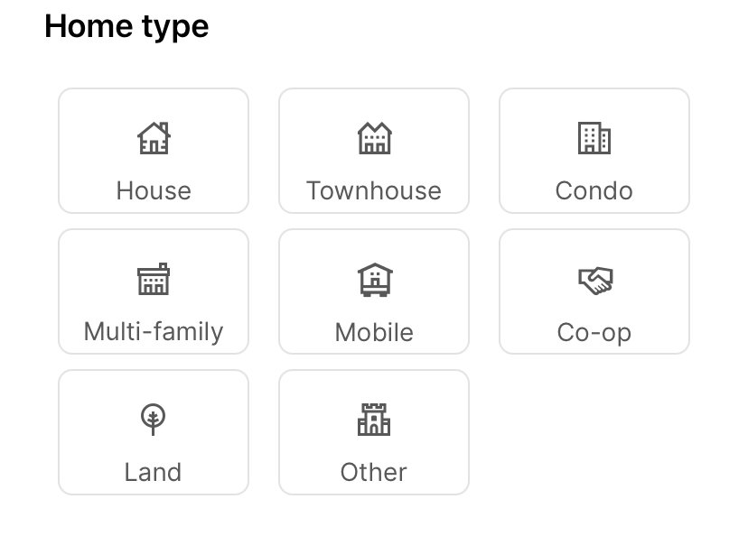


I liked the idea of presenting the home types as illustrations, and I thought I could match the style of the illustration on the log in screen, so I sketched some ideas for each home type, and then chose my favorites to make into final sketches that I used in the final designs.


Logo Design
When I was designing the logo I faced the same challenge as when I was choosing the color palette - I wanted to make the logo fun and interesting, without it seeming too cutesy or childish.
Once I found a font I liked, I wanted to put a ghost design in one of the letters. I decided it should go in the “H” because that way I could take the H and use it as a smaller logo to use in the app icon.


Once I decided on the wordmark, I created the app icon, and placed it on a phone screen to make sure I liked the look of it.


Final Designs
I created the log in screen, the list and maps view for the home search, the home detail screen, and the filters screen. This is a work in progress, and there are still some features that I need to add to those screens, which I have noted below.
I also will be designing the pages for the account screen and the favorites screen.
Log in screen

I included the illustration that I created to welcome the ghosts to the app. From this screen, the ghost can log into their account, or sign up for an account.
Next steps:
- Show the process for validating login, with error states for missing or invalid information.
- Add 3rd party logins
- Create the sign up screen.
Search
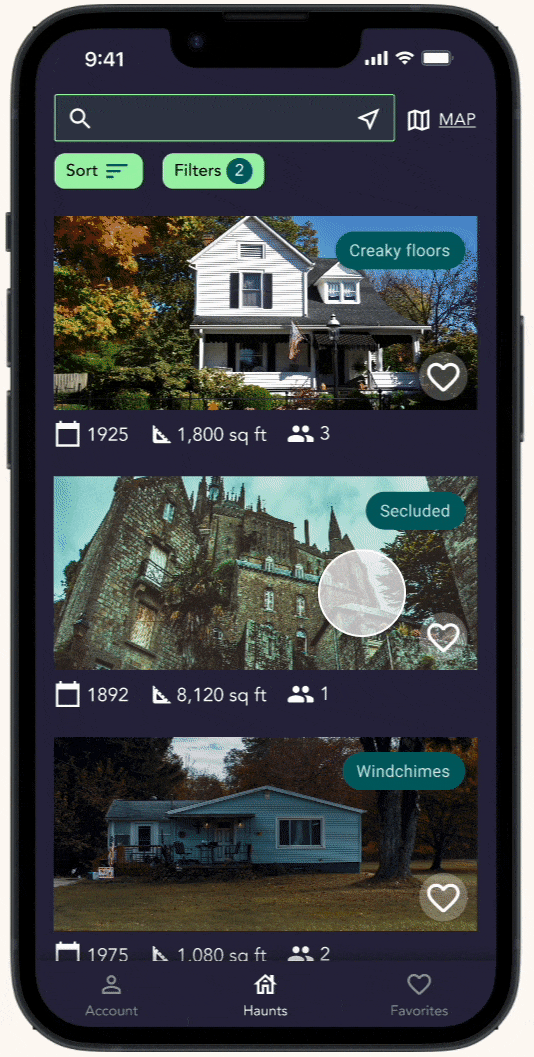


I designed both the list view and the map view for the search process. The ghost can switch back and forth between the views by tapping on “map” or “list.”
Next steps:
- Design the pop up that appears when the ghost taps one of the points on the map.
- Continue refining based on user testing.
Filters

I designed the filters based on the information I received in the interviews, and used real estate apps as inspiration for various ways of laying out the filters.
Next steps:
Continue adding and editing filters based on user testing and feedback.
Home Detail Page
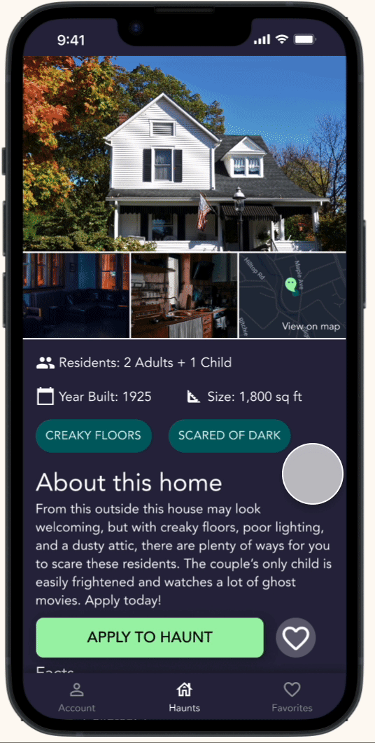
For the home detail page I included the key details for the home that ghosts would want to know when considering whether or not to apply. From this page, the ghost can apply to haunt, or add the home to their favorites.
Next steps:
- Design the pop up that will appear when the user clicks on “apply.”
- Update/edit based on user feedback
Next Steps & Reflections

For my next steps I will be continuing to add more features and pages, including the account and favorites screens. I will also look into adding a social feature.
This project challenged me to step into the shoes of individuals with very different life (or death) experiences from me.