


Course Redesign
Pri-Med:
Pri-Med provides medical professionals with continuing education. They wanted a redesign of their existing course to streamline user experience and increase the number of students who successfully completed the course.
Role
Lead UX Designer
Tools Used
Figma, Mural
Time
3 Weeks

Process

This project required a quick turnaround, so I began by meeting with the client and going over what their pain points and goals were, using Mural to organize my notes.

Next, I reviewed the current components that were used on the site, and noted what the issues were. I created improved versions of these components.

I mocked up some pages using the new components and presented them to the client in prototype format so they could understand how these updates would look in action.

I took the client’s comments and feedback and adjusted designs accordingly, repeating this process until I had a final design the client was happy with.
COMPONENT
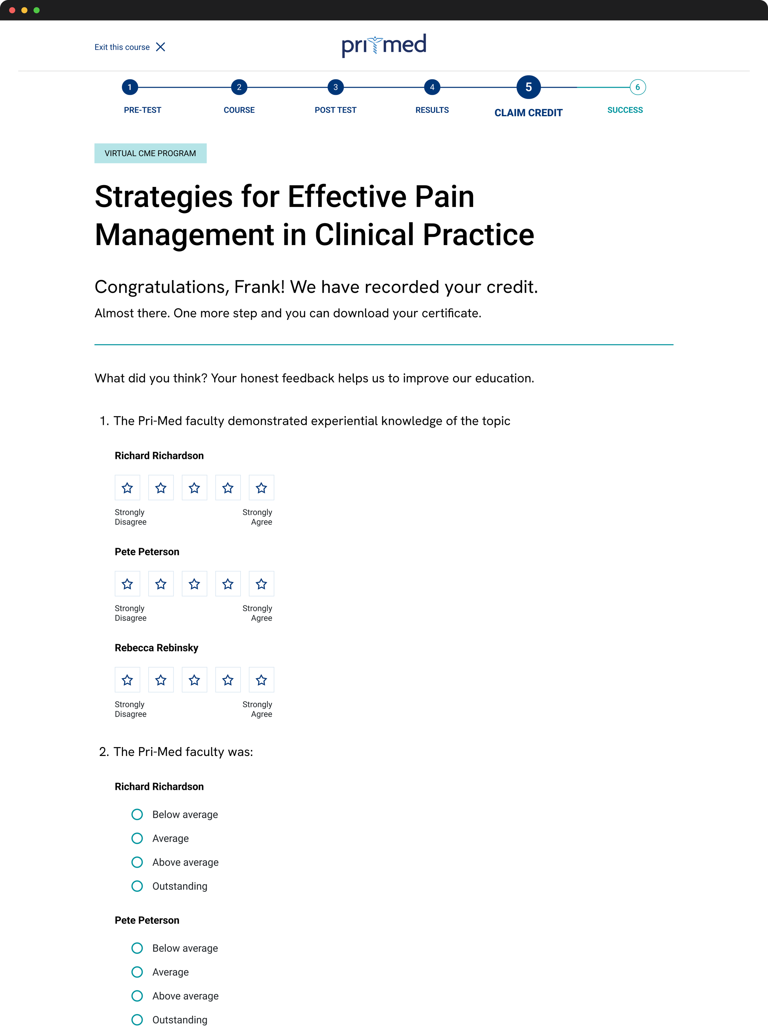
Step Indicator

This stepper was not visible on mobile at all
It was hidden by default, and the user was required to click on it to reveal the title of the step they were on.
The steps did not line up with the steps of the course, for example, the “Your results” step was not the title of any page.
REDESIGN

Step Indicator
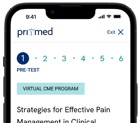
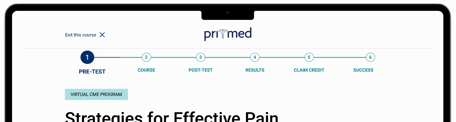
Steps are clear and match the steps of the course
Easily translated to mobile design
There are no extra clicks needed to view the stepper
Stepper is stuck to the top of the screen so it is always visible
COMPONENT
Questions

Questions take up unnecessary vertical space
Confidence question gets lost because it doesn’t look like part of the question
Questions
REDESIGN

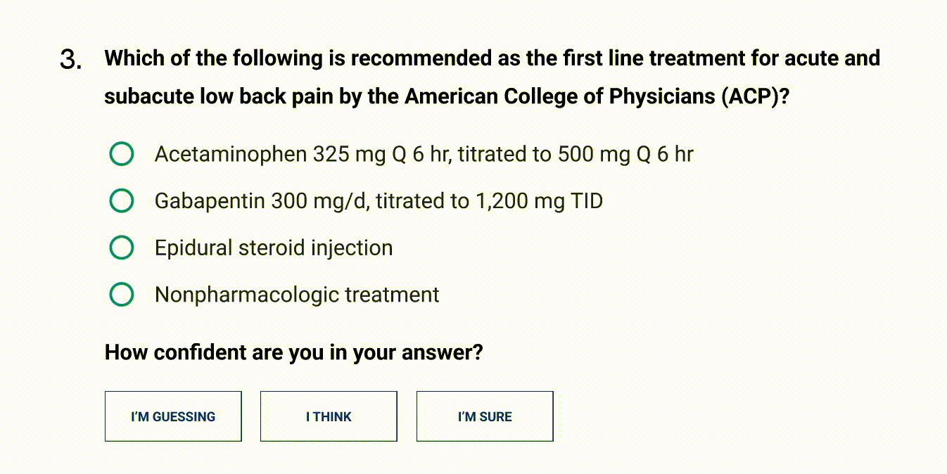
Question number is moved to the side to take up less space
Confidence question uses buttons to differentiate from main questions, and takes up less vertical space
COMPONENT
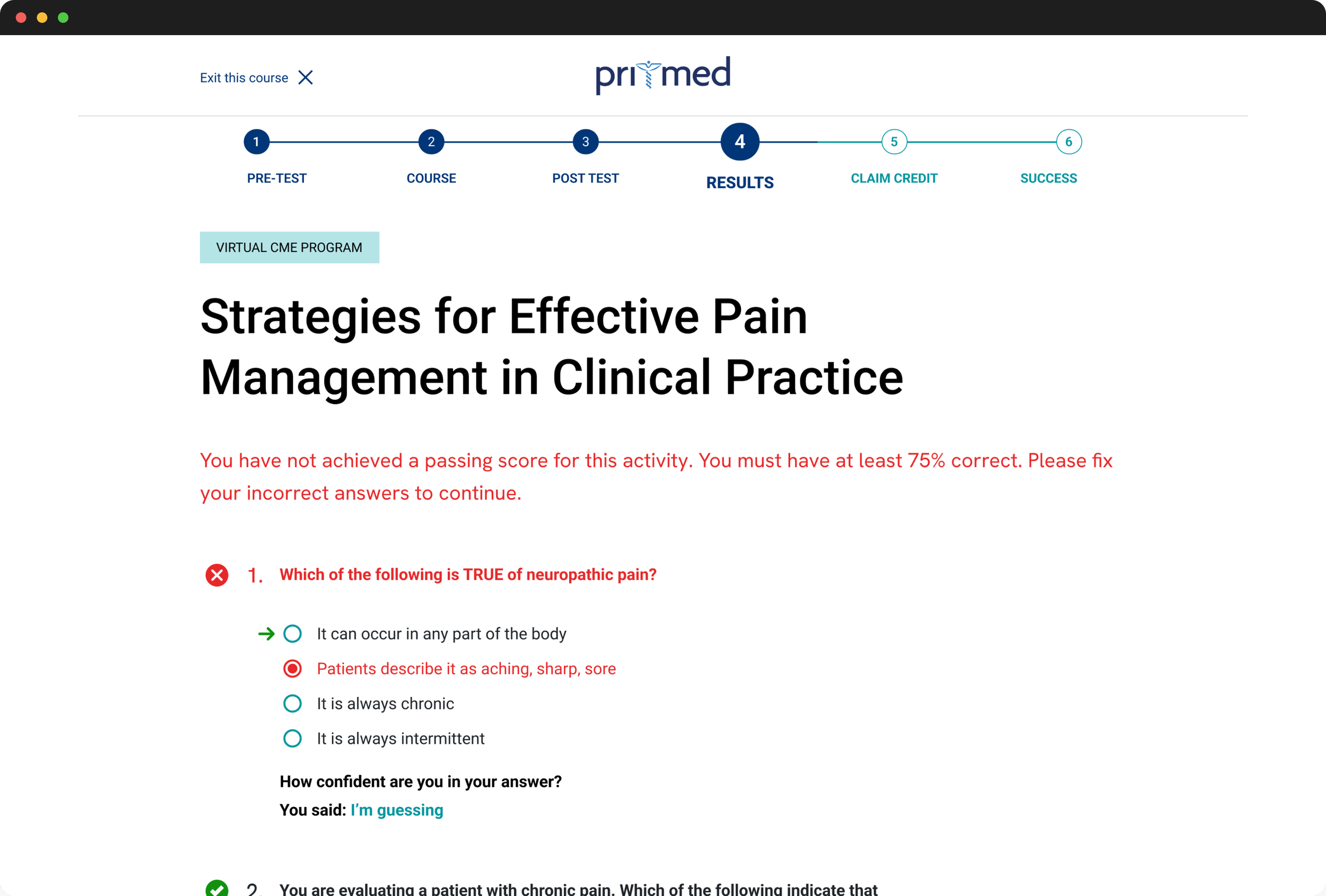
Incorrect Answers
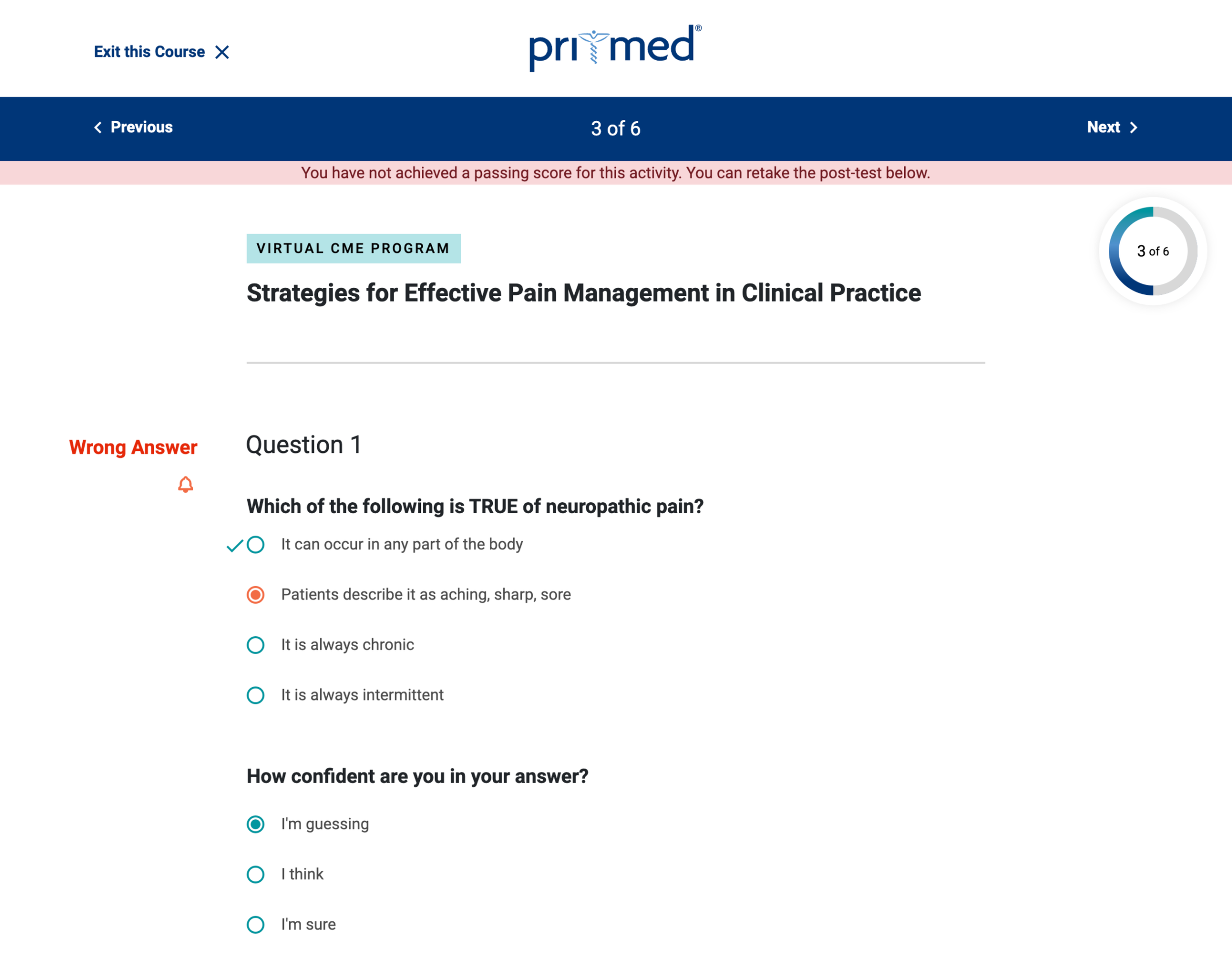
Non-passing message is very small and easily missed at the top of the page
Poor use of vertical space
The red bell icon does not imply incorrect
The checkmark indicating which answer is correct is unclear and unnoticeable
Confidence response shouldn’t be changeable after a response is submitted
Incorrect Answers
REDESIGN
Non-passing message is moved down underneath the heading and is made more prominent
Better use of space
The entire question text turns red, making it more quickly identifiable as incorrect
Unneccesary “wrong answer” text is replaced by a red X icon
The correct answer clearly indicated by a green arrow
Confidence question is no longer changeable
COMPONENT
Correct Answers
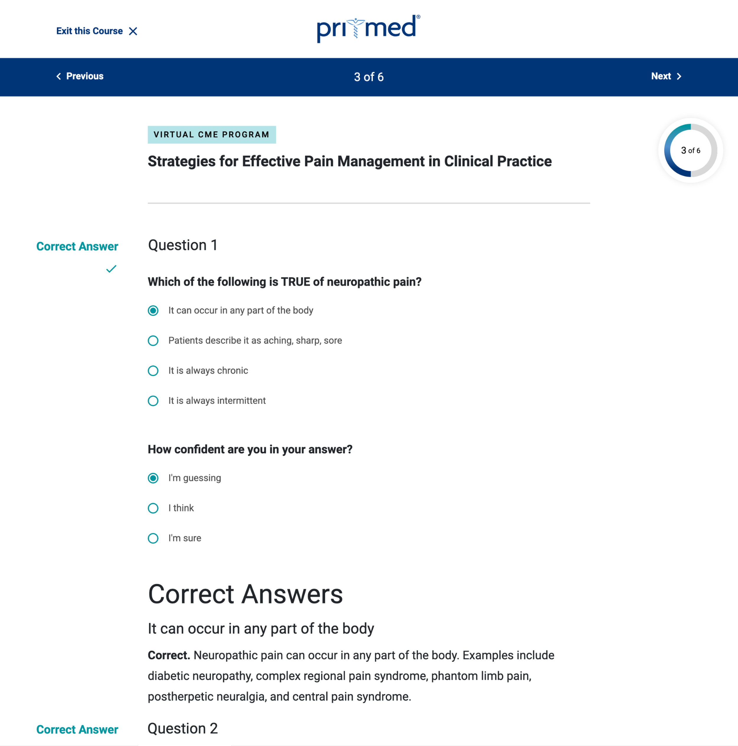
Unlike with wrong answers, there is no indication informing the user that all answers are correct
Correct answer color is the same teal used elsewhere on the site, and does not quickly imply correct.
The explanation formatting is confusing, not clearly connected to the question, and uses up unnecessary vertical space
There is a lot of redundant text, the word “correct” is shown three times
Confidence response shouldn’t be changeable after a response is submitted
Correct Answers
REDESIGN
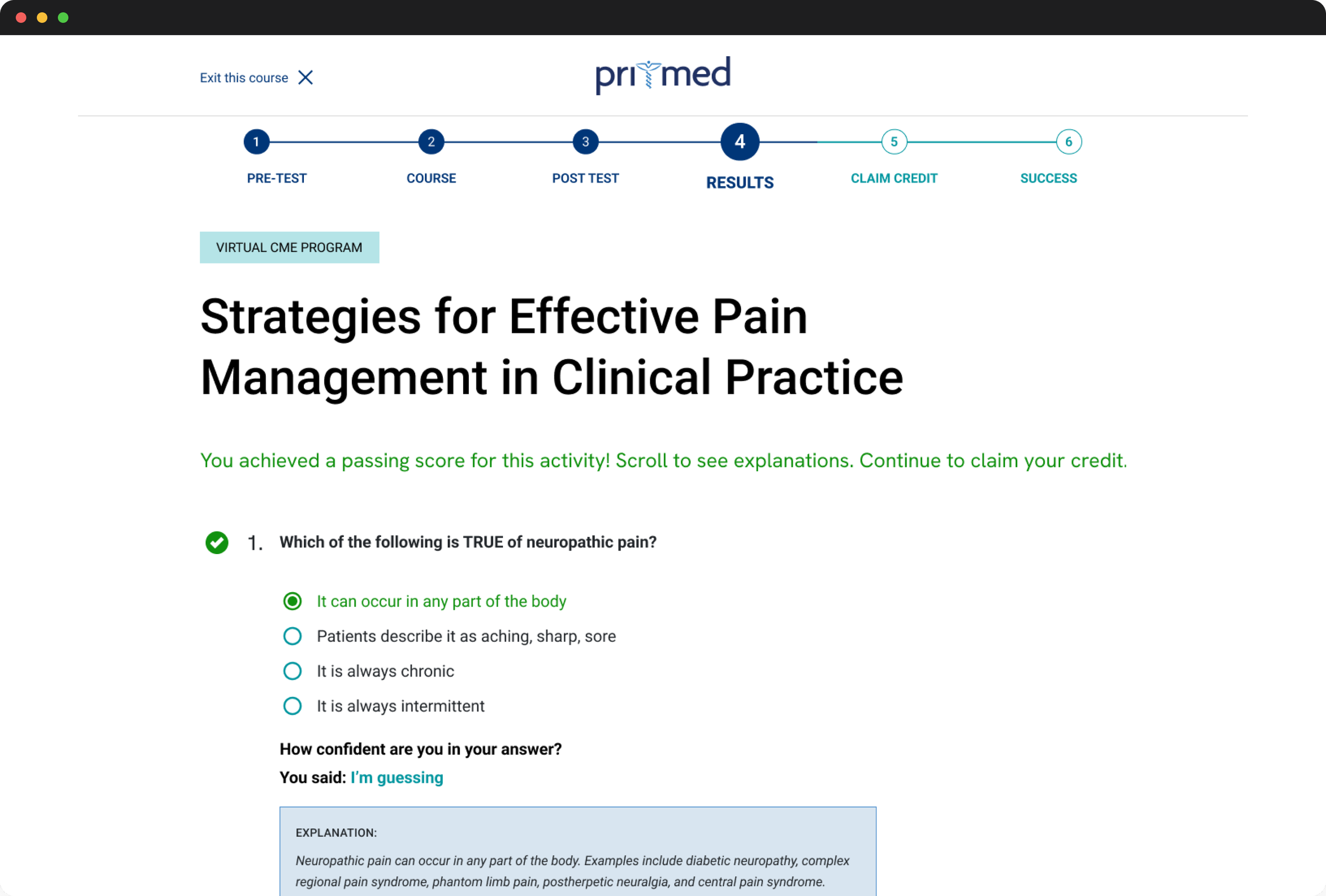
The passing message is immediately visible without any scrolling
Green is used to indicate a correct answer, which is more quickly identifiable as implying correct
Explanation is more compact, and more clearly connected to the question
Better use of space overall
The use of the word “correct” is no longer necessary due to the green text and the checkmark
Confidence question is not changeable
COMPONENT
Survey
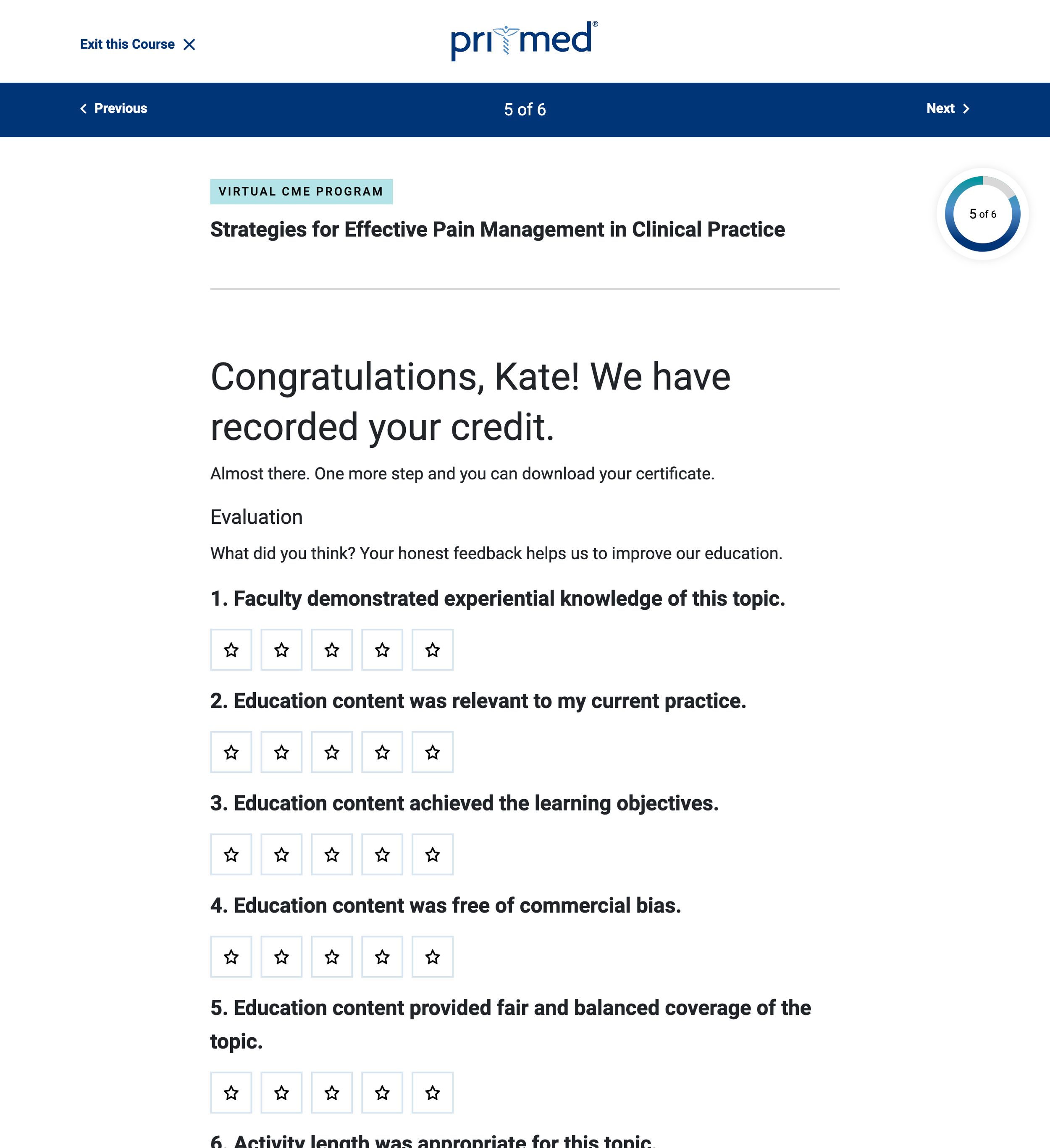
The spacing is too tight, making the content difficult to scan
There is no explanation of what each end of the scale represents
There is no option for a type of question with sub-questions
REDESIGN
Survey
Spacing and design is improved and easier to scan
“Strongly disagree” and “strongly agree” added to the ends of the five stars so the user can understand the scale
Options added for questions with sub questions
COMPONENT
Survey Question
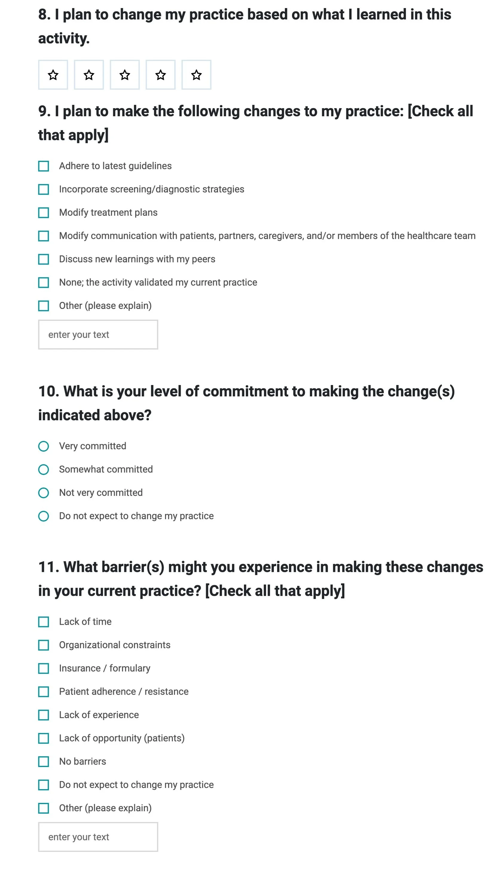
Within the survey, there was a question that forced the user to answer irrelevant questions, regardless of their responses. I wanted to be sure to tackle this in my redesign.
Question #8 necessitates a yes/no/maybe type response, but the user has to choose from 1 - 5 stars with unclear meaning
Even if the user does not plan to change their practice, they still have to scroll through questions #9, #10, and #11
Survey Question
REDESIGN

For this question I made it so users only had to answer more questions depending on how they answer the first question
First, the user sees the question with yes/no/maybe options, which makes more sense than the undefined five stars in the original design.
If they click on “no,” a new question appears asking them to provide a reason for their response. They no longer need to go through irrelevant questions if they choose the negative answer.
If they click on “maybe” or “definitely,” three new questions appear asking for more information.
This process provides a better user experience by adjusting the questions based on user responses.
The user is more likely to complete the survey if they aren’t required to go through unnecessary questions.

Next Steps & Reflections
Next steps would include user testing and making any adjustments based on user feedback. I would also want to further look into other Pri-Med courses to determine if there are other components to address, like different question types or course stages.
The challenge of a redesign is knowing what elements to keep and what elements to change. By involving the client in several steps of the process I could be sure I was meeting their needs.